Understanding and using CAT Graphs
How to read our country graphs
This page does not yet reflect the changes from the new CAT methodology (published September 2021) and will be updated soon.
To understand the various elements of the interactive graphs of assessment previous to September 2021, please continue reading.
This page is designed to help you understand the various elements contained in our standard country assessment graphs, as well as show you how to use our interactive graphing software.
Key conceptual components
The key components of the graph are:
- The Fair Share Range bars
- The historical emissions data (with and without forestry emissions - LULUCF)
- The various targets and pledges that each country has made
- CAT current policy projections
Interactive Graph Features
The graphing software is interactive and allows you to switch on and off all data series as well as zoom in on the graph. Brief instructions on how to use these features should be below each graph, however some more detailed instructions with screenshots should help you understand these features better. They are covered in the following sections:
- Toggling data series on and off
- Zooming in and out (resetting the graph back to default)
- Downloading the data you are seeing
Example graph
Understanding our Fair Share Range bars
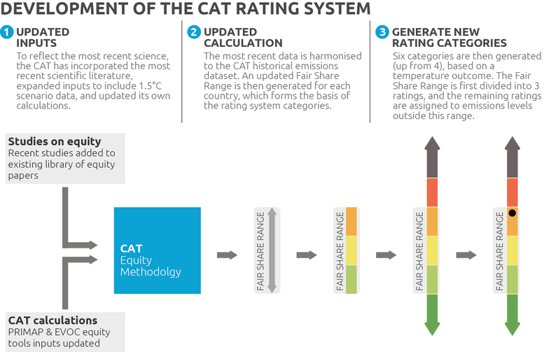
The four vertical bars with the various colours is the first step in understanding our graphs properly. Each colour represents one of the six rating categories as per the Climate Action Tracker Rating System and these Fair Share Range bars are the basis on which we assess countries' policies and targets.
As the name indicates, each bar, for each country, is a representation of what can considered to be a "fair" contribution of that country towards achieving the globally agreed aim of holding warming well below 2°C, and pursuing efforts to limit warming to 1.5°C. There is a much more detailed explanation of how we come to these values in our Methodology section but in short what is "fair" is a very open question depending on what your perspective is. Should it be based on historical responsibility or capability to act or equal emissions per capita? What should the right balance of the various perspectives be? The Climate Action Tracker does not seek to make a judgement on what perspective should be taken; our methodology instead attempts to construct a range of Fair Share covering as many different approaches as possible. We do this by combining emissions allowances for each country from the range of estimates in the literature.
Due to the fact the various academic studies cover different countries over different time spans, each bar represents a snapshot of the literature for that given year. In other words, the Fair Share Range bar for 2020 might contain different studies than the Fair Share Range bar for 2050.
We then divide the Fair Share range of each country into three different rating categories, based on temperature levels that would result from all countries choosing this level of effort. We also assign rating categories to the emissions levels below and above the Fair Share range in order to rate commitments that fall outside the country’s Fair Share range.
On the graph, the generated bars then are compared against the country's proposed targets (e.g. NDC pledges submitted to the UNFCCC process). Which colour band the target falls into shows the rating the country is given (represented by the black dot in the picture below). We also compare current policy projections using the same method.
For more information, please visit our Methodology page.
Historical emissions
At the Climate Action Tracker we rate governments based on emissions excluding emissions from forestry and thus we separate historical emissions into two categories, forestry related emissions (green line) and all emissions excluding forestry (black line). We do this so that clear signals of progress in reducing emissions in the overall economy can be viewed.
Forestry emissions, or rather emissions from LULUCF (Land Use, Land Use Change, and Forestry), are unique in the way they are calculated. The data can be negative ("net sink") or positive ("net emissions") depending on whether a country is increasing or decreasing their land-based carbon stocks. Variations from one year to the next can often be significant and unrelated to policy changes.
This is why we generally refer to emissions excluding LULUCF by default. This allows us to track the real progress a country has shown in decreasing emissions in the general economy (energy sector, transport, industry, etc). For most countries, forestry emissions are a relatively small percentage of overall emissions, however, for certain countries that are clearing significant portions of forest, LULUCF emissions can sometimes be greater than general economy so it is critically important that we also track this category of emissions so we can provide a more accurate overall picture.
Targets and pledges
For each country we present the entire history of all targets and pledges that country has formally submitted to the United Nations Framework Convention on Climate Change (UNFCCC) process, since the 1997 Kyoto Protocol. These targets and pledges are categorised by the international treaties' names, usually taken from the city that hosted the Conference of Parties (COP) in that year. These include:
- NDC or Nationally Determined Contribution that forms a part of the Paris Agreement (usually focused on 2030, but sometimes 2035)
- 2020 targets (as part of the Copenhagen Accord and Cancún agreements)
- 2nd commitment period of the Kyoto Protocol (2013–2020)
- 1st commitment period of the Kyoto Protocol (2008–2012)
- Longer term pathway based on national policy commitments
Countries use different approaches and baselines to formulate their targets and pledges, no uniform approach is required. Sometimes they have unconditional targets and/or conditional targets (dependent on other countries' actions). Some countries base their targets on a percentage reduction from the emissions in a certain reference year (these years are usually 1990, 2000 or 2005 and we at the CAT try to convert targets into a standard reference year to help comparability between countries). Other countries have set targets based on a certain reduction from a projection of a business as usual reference line. Other countries have used emissions intensity targets which makes the actual target dependent on the the level of economic growth they experience. CAT tries to cut through this multitude of approaches to compare countries on an even footing.
The graphic below gives an overview of the icons we use for each type of target. For more information, please visit our Methodology page.
Current policy projections
It's one thing to know what emissions level a country has committed to, it's another to know whether a country is on track to achieve this target. Including a current policies projection is a core part of any CAT country assessment. We represent this with our signature blue colour and it is shown as either a line or a range of values indicating the maximum and minimum values of our estimate. For more information, please visit our Methodology page.
Toggling data series on and off
Our graphs are interactive and you have almost full control over what data is displayed or not. To remove a data series from the graph, simply click on any of the legend items in the top right hand corner of the graph. This will "turn off" the data series and cause the legend item to fade out and make the text turn grey. To turn a data series back on, simply click the same legend item again, the data will reappear and the legend text will become black again. You can do this for all data series except for our Fair Share Range bars, these are the only items you cannot currently turn on and off.
Zooming in and out
If you would like to take a closer look at a part of the graph, you can use your mouse to create a box by clicking and dragging. When you release, the graph will automatically resize to the dimensions of the box you created. There are three ways you can zoom in:
- Horizontally - simply drag your mouse in a straight line horizontally to zoom in on particular years (keeps the Y-axis the same)
- Vertically - simply drag your mouse in a straight line vertically to zoom in on the emissions levels (keeps the X-axis the same)
- Freestyle - to change both the Y-axis and the X-axis you can drag diagonally to create whatever shape rectangle you like. This will zoom into whatever you like, however is tricker to control.
If you would like to have the graph return to the original scale that was displayed when the page first loaded, all you need to do is double click anywhere inside the graph area where the data is displayed (not where the legend or axis titles are). This should cause the graph to zoom out to 100% where everything should be properly displayed. If you that trick doesn't manage to work, you can also just reload the page to reset the graph.
Download data
You can download the all the data in the graphs in spreadsheet format using the buttons beneath the graph:
- To download the historical data, targets and pledges, and policy projections, click the button "Download scenario data"
- To download the data behind the Fair Share Range bars, click the button "Download Fair Share data".
Happy graphing!
We hope these instructions on how to read and use our CAT graphs were helpful. Should you have any trouble understanding anything, please reach out to us via email and we will do our best to clarify the issue.
Stay informed
Subscribe to our newsletter